JavaScript Web App to Measure Height of an Object
by using Triangulation and the Orientation Sensor of the Device
In trigonometry and geometry, triangulation is the process of determining the location of a point by forming a triangle to the point from a known point.
This article describes how to make a web app by using vanilla JavaScript that measures the approximate height of an object by pointing the smartphone to its top (or bottom, in case the height to be measured is from the ground to the smartphone’s level). For that, the user moves a certain distance away from the object and points the rear-facing camera of the smartphone to the top of the object while observing the rear-facing camera’s stream on the screen. The app measures the angle to the top (or bottom) by using the orientation sensor of the device, and, knowing the angle and the distance from the object, the approximate height from the smartphone’s level upward (or downward to the bottom of the object) is measured and displayed on the screen. This method is called triangulation.
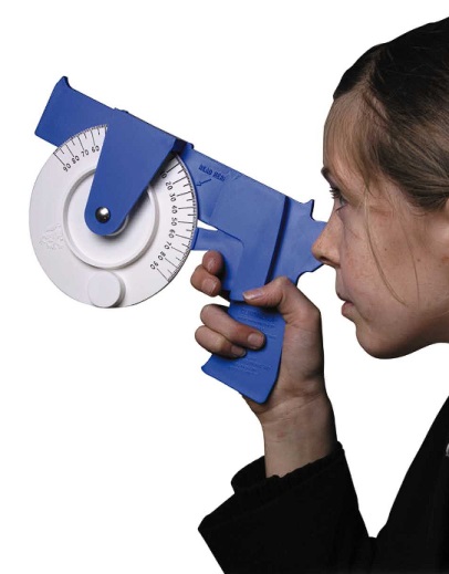
Triangulation principle is used in forestry to measure the height of a tree with a device called clinometer, Figure 1.
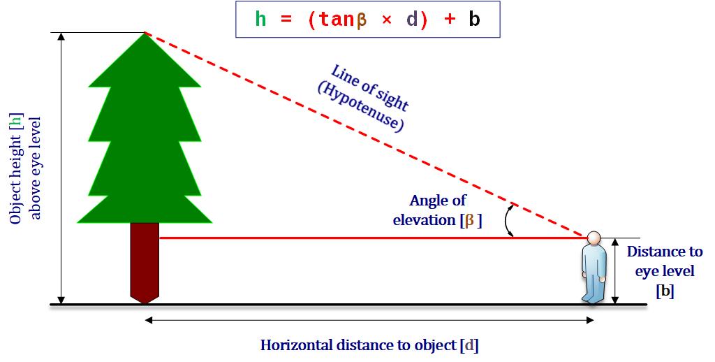
The clinometer measures the angle between a horizontal line and the line of sight to the top of the tree. To measure the height of the tree, the horizontal distance between the observer’s eye and the tree is measured by a measuring tape. Then, by using the triangulation principle, the height of he tree is calculated, as illustrated in Figure 2.
The web app described in this article uses the same triangulation principle described above, but instead of a clinometer, a smartphone is used for measurement and calculation.
OBJECTIVES
Building a mobile web app by using JavaScript programming language to measure the approximate height of an object by using the triangulation principle, the orientation sensor of the device and the stream of its rear-facing camera.
AQUIRED SKILLS
- Programming a mobile web app in JavaScript, debugging and styling it.
- Interpreting and using the input data from the orientation sensor in a device.
- Accessing the stream of the rear-facing camera of a device.
- Applying triangulation principle for measurement.
CODING
First a new HTML document, named index.html, is created and a title is given to the page (here: ‘Height Measuring Tool’). An empty CSS file style.css, for the styles, and an empty JavaScript file script.js, for the logic, are linked to the document index.html.
In the document’s <body> element a new division is added with the id="heightInfo", which is currently empty, but eventually it will show the height of the object it is being pointed at.
An onload event is added within the <body> element to execute a JavaScript function main() once the document has loaded.
<!-- index.html -->

<html>
    <head>
        <title>Height Measuring Tool</title>
        <link rel="stylesheet" href="style.css">
        <script src="script.js"></script>
    </head>
    <body onload="main()">
        <div id="heightInfo"></div>
    </body>
</html>
Then the main() is defined in the script.js. The key to making this app is finding out the device orientation. This is done by adding an event listener to the window window.addEventListener(), which will listen for the device orientation event deviceorientation. When this orientation changes, it will trigger a callback function called onOrientationChange().
/* script.js */

function main(){
    window.addEventListener("deviceorientation", onOrientationChange)
}

function onOrientationChange(event){

}
The console.log() static method, which outputs a message to the console, is used to log the information associated with the event. However, a laptop or a PC are not equipped with an orientation sensor to measures the orientation of a device relative to an orthogonal coordinate frame $X$, $Y$ and $Z$, so, tilting the laptop or the PC won’t trigger the event. How to debug a device, which doesn’t have an orientation sensor is explained in the next section.
DEBUGGING
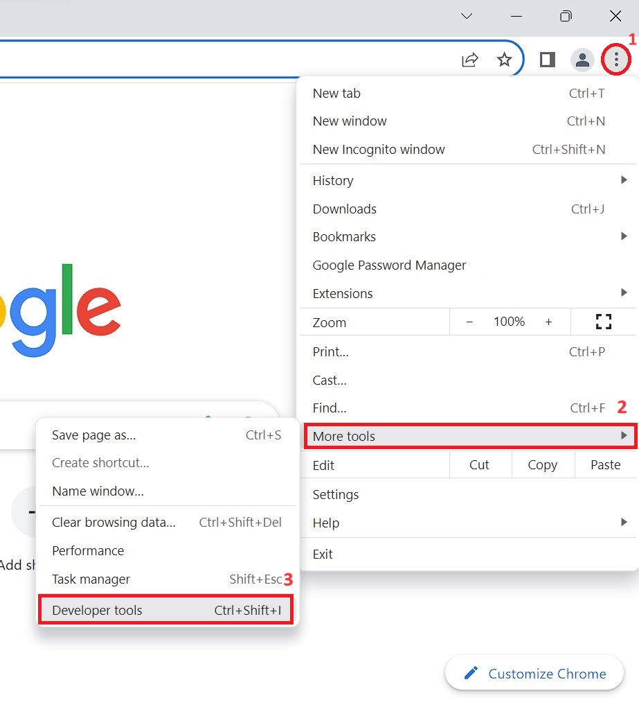
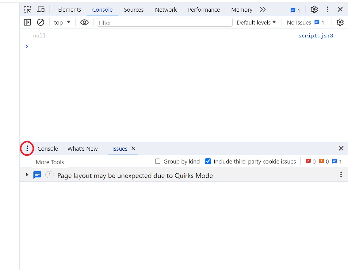
To debug a device, which doesn’t have an orientation sensor, the Developer Tools in the web browser app is used. For example, in the Chrome browser, the Developer Tools could be accessed as shown in Figure 3.
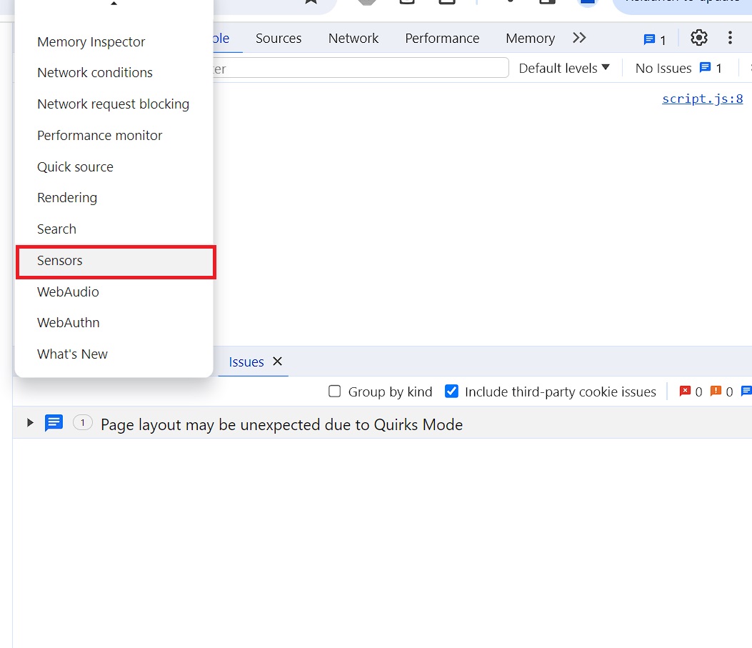
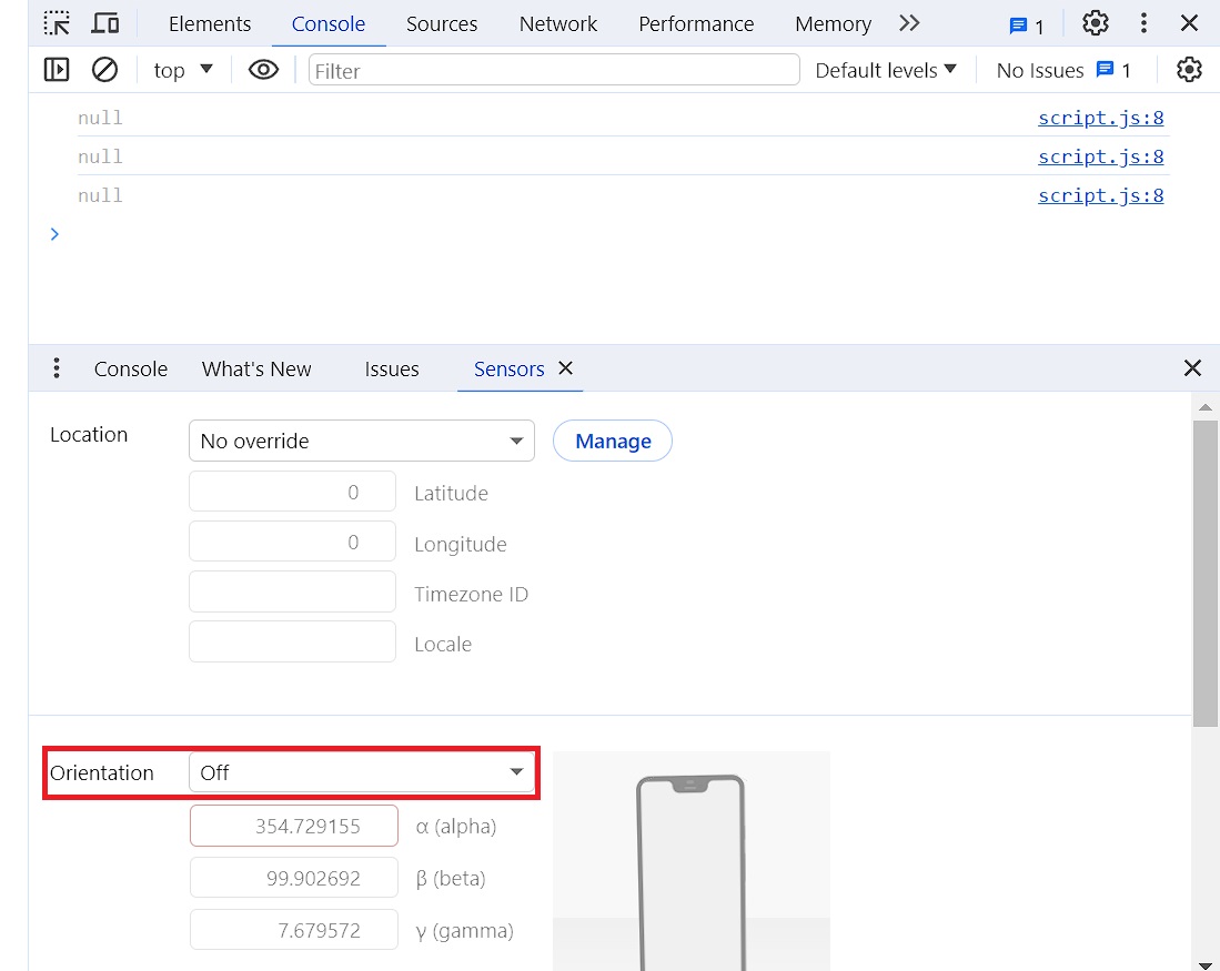
A window will open inside the browser as shown in Figure 4. Then, the ‘More Tools’, the three vertical dots at the far left of the tabs bar of the bottom section, is pressed followed by choosing the ‘Sensors’ tool from the displayed list, Figure 5. The ‘Sensors’ panel opens, Figure 6, which is used to override geolocation, simulate device orientation, force touch, and emulate idle state. For this project only the ‘Orientation’ section is used.
Assuming a Cartesian coordinate system $X$, $Y$ and $Z$, as illustrated in Figure 7, where the device is flat on a level surface, like a table, with the screen facing up.
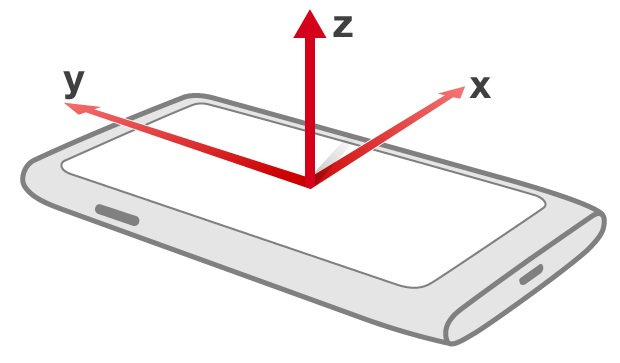
Device orientation defines three types of rotation, which are are follows:
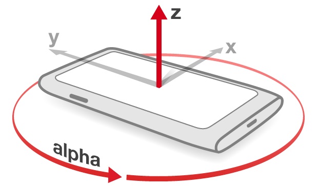
- $\alpha$ (alpha): The angle of rotation around the $Z$-axis, Figure 8, ranges from $-180$ to $180$ degrees or $[-180°, 180°)$.
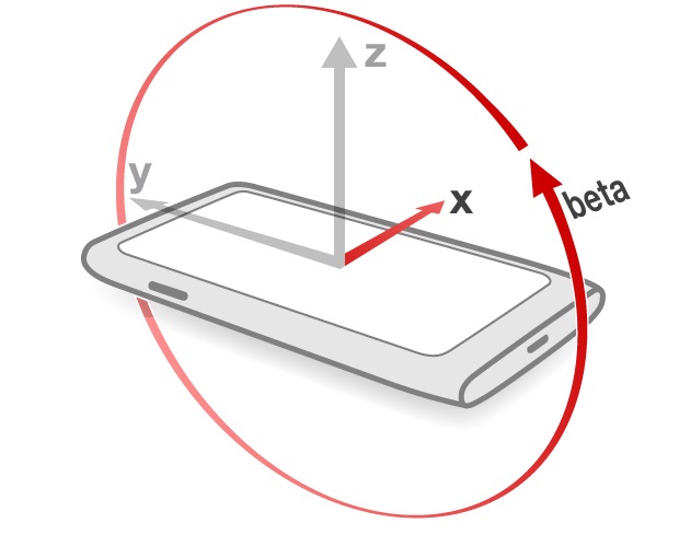
- $\beta$ (beta): The angle of rotation around the $X$-axis, Figure 9, ranges from $-180$ to $180$ degrees or $[-180°, 180°)$.
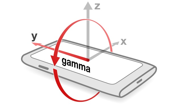
- $\gamma$ (gamma): The angle of rotation around the $Y$-Axis, Figure 10, ranges from $-90$ to $90$ degrees or $[-90°, 90°)$.
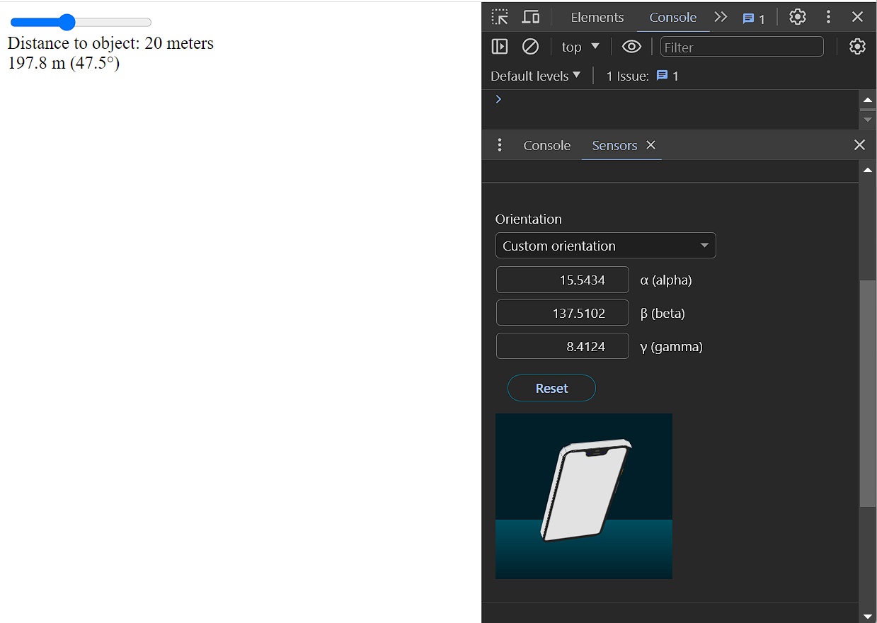
By setting a custom orientation for the virtual device in the Developer Tools sections, either by dragging the device’s image or, for precision, by changing the values of $\alpha$, $\beta$ and $\gamma$, the log in the console panel changes accordingly, as shown in Figure 11.
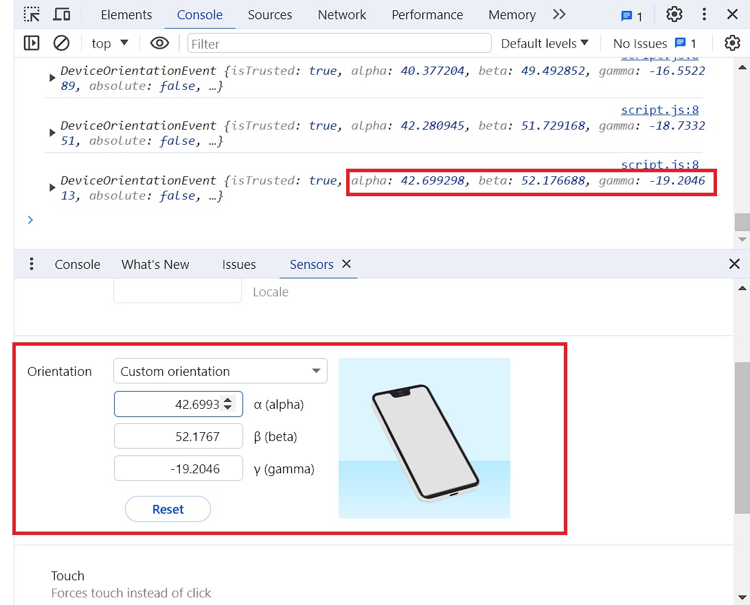
However, in this project, only the changes in the value of $\beta$ is required. For that reason, in the file script.js the console.log(event) could be changed to console.log(event.beta) to focus on the value of $\beta$.
$\beta = 0$ degrees when the device is flat on a level surface, like a table and the screen facing up, and when the device is in a vertical position and the screen facing the user, then $\beta = 90$ degrees. However, for this project, it is necessary to have $\beta = 0$ degrees when the device is in a vertical position and the screen facing the user, and $\beta = -270$ degrees when the device is flat on a level surface and the screen facing down; range of $\beta$: $[-270°, 90°)$. To achieve this, $90$ degrees is substracted from the $\beta$. To change the negative degrees to positive ones within the range, an if is added, which tests whether $\beta$ is smaller than zero, in which case it multiplies $\beta$ with $-1$. In this way the range of $\beta$ becomes: $[0°, 90°)$, as shown in the following code:
/* script.js */

function main(){
    window.addEventListener("deviceorientation", onOrientationChange)
}

function onOrientationChange(event){
    let angle = event.beta-90;
    if(angle<0){
        angle = -angle;
    }
    console.log(angle);
}
To convert this angle $\beta$ into height, the distance to the object is required. For this, in the script.js file, new variables are defined: distToObject, which is a previously measured value by the user, and heightOfObject, the height of the object to be measured, which is calculated by the triangulation method as follows:
const heightOfObject = Math.tan(angle*Math.PI/180)*distToObject;
The angle $\beta$ is converted into radians by multiplying it with $\frac{\pi}{180}$.
The script.js file looks now like this, considering a distance of $20$ meters to the object:
/* script.js */
function main(){
window.addEventListener("deviceorientation", onOrientationChange)
}
function onOrientationChange(event){
let angle = event.beta-90;
if(angle<0){
angle = -angle;
}
const distToObject = 20;
const heightOfObject = Math.tan(angle*Math.PI/180)*distToObject;
document.getElementById("heightInfo").innerHTML =
heightOfObject.toFixed(1)+" m (" +angle.toFixed(1)+"°)";
}
To the distance to the object as user-input in the app, a slider, with range between $1$ to $50$ meters, and default value of $20$ meters, is added to the app by coding it into the index.html. Then an info field is added to the slider by using the <div> tag.
<!-- index.html -->

<html>
    <head>
        <title>Height Measuring Tool</title>
        <link rel="stylesheet" href="style.css">
        <script src="script.js"></script>
    </head>
    <body onload="main()">
        <input id="mySlider" type="range" min="1" max="50" value="20">
        <div id="myLabel"></div>
        <div id="heightInfo"></div>
    </body>
</html>
To pass the value of the slider to the distToObject, in the script.js, the getElementById() method is used to return the value of mySlider element:
const distToObject = document.getElementById("mySlider").value;
To print this distance on the screen, in the script.js, the innerHTML property of the getElementById() method is used to return the HTML content (inner HTML) of myLabel element, which has a specified id in previously made <div> container:
document.getElementById("myLabel").innerHTML =
        "Distance to object: "+distToObject+" meters";
Figure 12 shows the current output page of the app in the browser and the Developer Tools panel.
Moving the slider in its current situation won’t update the value under it, it requires an oninput event, which fires when the value of the slider element is changed. However, this is not necessary to do here, because the orientation sensor in a device is quite sensitive and the orientation event will be dispatched all the time and moving the slider will update the value under it all the time.
In the next section, the camera input from the rear-facing camera of the device is added, which allows the user to align the device to the top (or bottom) of the object properly.
CAMERA STREAM
A new feature is added; the camera input from the rear-facing camera of the device, which allows the user to align the device to the top (or bottom) of the object. This is done by accessing the navigator.mediaDevices property that offers various methods for accessing the camera, microphone as well as screen sharing, and invoking the getUserMedia() method with video property set to true.
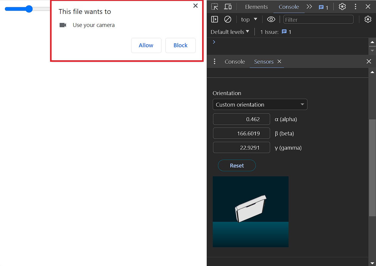
When getUserMedia() is invoked, which returns a Promise object video:true. The Promise object has two instance methods; then() and catch(). The then() method takes two arguments: callback functions for the fulfilled (success) and rejected (error) cases of the Promise. In this case only one callback function is used, function(signal), which is for the fulfilled case of the Promise. The browser prompts the User for permission to access the available device’s camera, Figure 13. If the User gives the permission, then this allows the fulfilled (success) callback function that has access to the video signal (MediaStream) to retun the Promise. This signal (MediaStream) is passed to a newly-created video element, with id myVideo, which is added in the index.html too: <video id="myVideo"></video>. The srcObject property returns the MediaStream object and play the video.
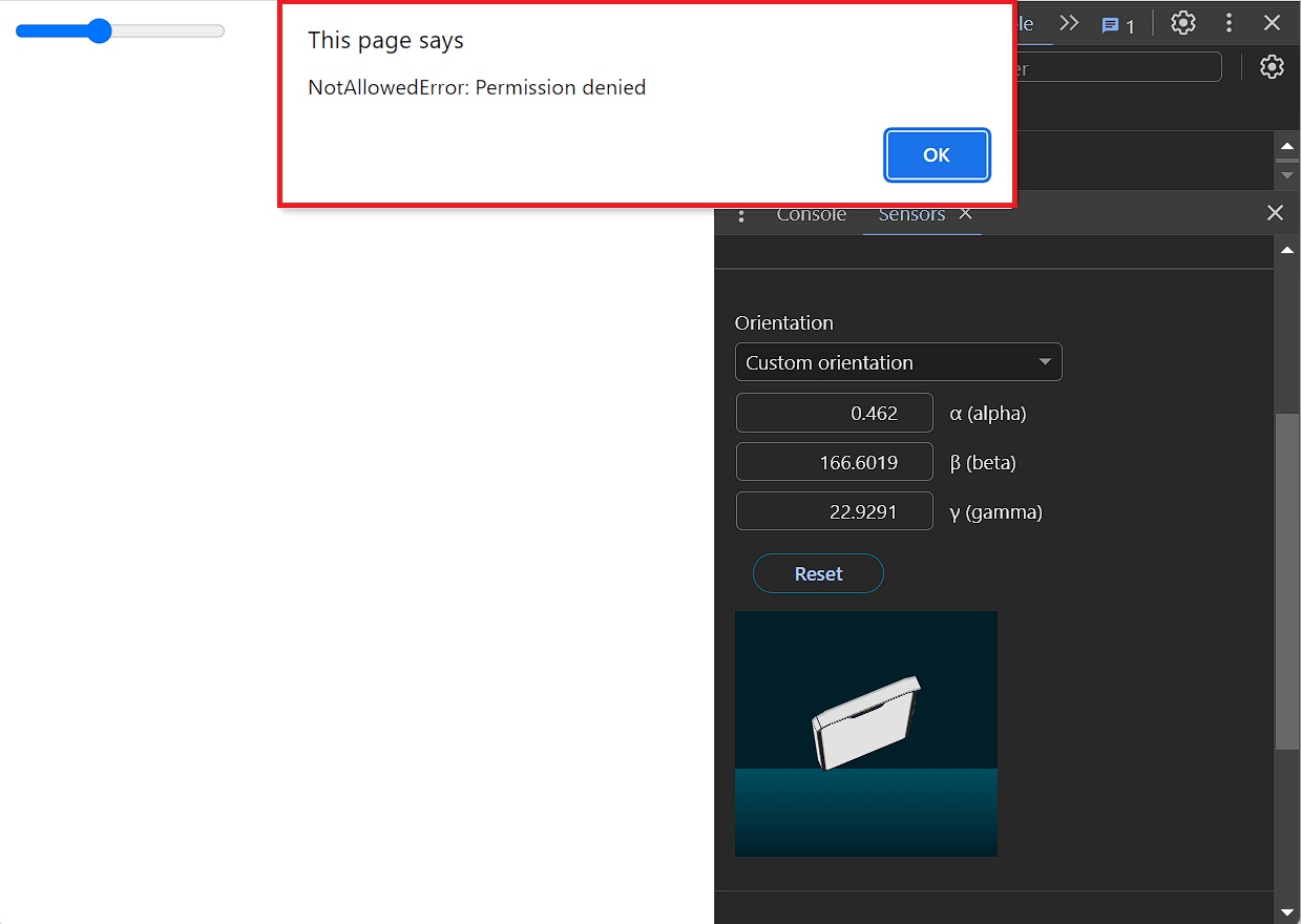
The catch() method of Promise instance schedules a function to be called when the Promise is rejected, here: the access to the returned error information, Figure 14.
Refreshing the page now shows the video from the webcam, Figure 15, the values appear as the device moves (here the virtual phone in the Developer Tools).
The JavaScript code in the (script.js) becomes as follows:
/* script.js */
function main(){
window.addEventListener("deviceorientation", onOrientationChange)
navigator.mediaDevices.getUserMedia({video:true})
.then(function(signal){
const video=document.getElementById("myVideo");
video.srcObject=signal;
video.play();
})
.catch(function (err){
alert(err);
})
}
function onOrientationChange(event){
let angle = event.beta-90;
if(angle<0){
angle = -angle;
}
const distToObject = document.getElementById("mySlider").value;
document.getElementById("myLabel").innerHTML =
"Distance to object: "+distToObject+" meters";
const heightOfObject = Math.tan(angle*Math.PI/180)*distToObject;
document.getElementById("heightInfo").innerHTML =
heightOfObject.toFixed(1)+" m (" +angle.toFixed(1)+"°)";
}
The next step is to style the app in the style.css file.
STYLING
To begin, the margin of the body is set to zero, the elements are centered, the overflow is set to hidden to remove the scrollbars, the font-size is enlarged, font-family set to ‘Arial’, its color is set to ‘white’ and double black shadows are added to the text, to make the shadow stronger.
/* style.css */

body{
    margin:0;
    text-align:center;
    overflow:hidden;
}
Next, the video object is aligned to the center of the body by making it absolutely positioned, i.e. removing it from the normal document flow, moving it’s top-left corner to the center by setting left and top to $50\%$ of the nearest parent container, the body, and then translating the object $50\%$ of its size to the left and $50\%$ of its size up, effectively centering it within the body. The z-index is set to $-1$ so that overlapping elements with larger z-index cover this one, i.e. so that other elements appear on top of this one.
The same is done for the heightInfo object. But here the text color is set to red and the font-weight to bold, and unlike video object, this one is translated $100\%$ of its size upward so that its bottom is in the middle of the screen. Then, $3px$ thick white bottom-border is added to it, with $100\%$ the width of the body. The user of this app should align this border with the top of the object to be measured.
/* style.css */

body{
    margin:0;
    text-align:center;
    overflow:hidden;
    font-size:25px;
    font-family: Arial;
    color: white;
    text-shadow: 0  4px #000, 0  4px #000;
}

video{
    position: absolute;
    left: 50%;
    top: 50%;
    transform: translate(-50%,-50%);
    z-index: -1;
}

#heightInfo{
    position: absolute;
    left: 50%;
    top: 50%;
    transform: translate(-50%, -100%);
    border-bottom: 3px solid white;
    width: 100%;
}
Then the slider and its thumb are styled, as shown in the next CSS code block, which is also the final style sheet (stored in the file style.css). The ::-webkit-slider-thumb is a CSS ‘pseudo-element’ that represents the “thumb” that the user can move within the “groove” of an <input> of type="range" to alter its numerical value.
/* style.css */

body{
    margin:0;
    text-align:center;
    overflow:hidden;
    font-size:25px;
    font-family: Arial;
    color: white;
    text-shadow: 0  4px #000, 0  4px #000;
}

#mySlider{
    appearance:none;
    width:90%;
    height:35px;
    background:#47f;
    margin-top:35px;
}

#mySlider::-webkit-slider-thumb{
    appearance: none;
    width:35px;
    height:35px;
    background:white;
}

video{
    position: absolute;
    left: 50%;
    top: 50%;
    transform: translate(-50%,-50%);
    z-index: -1;
}

#heightInfo{
    position: absolute;
    left: 50%;
    top: 50%;
    transform: translate(-50%, -100%);
    border-bottom: 3px solid white;
    width: 100%;
}
To optimize the layout for mobile devices, in the index.html file the “viewport” <meta> tag is used to control the viewport’s size by setting the width attribute to the number of pixels of the device-width and by setting the user-scalable attribute to no to disable zoom in and out actions. This is done by adding the following code line to the file:
‹meta name="viewport" content="width=device-width, user-scalable=no"›
<!-- index.html -->

<html>
    <head>
        <meta name="viewport" content="width=device-width, user-scalable=no">
        <title>Height Measuring Tool</title>
        <link rel="stylesheet" href="style.css">
        <script src="script.js"></script>
    </head>
    <body onload="main()">
        <input id="mySlider" type="range" min="1" max="50" value="20">
        <div id="myLabel"></div>
        <div id="heightInfo"></div>
        <video id="myVideo"></video>
    </body>
</html>
The use of the rear-facing camera of the device is specified in the following way: In the video object inside the JavaScript function main() in the script.js file, which is passed to getUserMedia(), is modified from:
navigator.mediaDevices.getUserMedia({video:true})
to:
navigator.mediaDevices.getUserMedia({video:{
        facingMode: 'environment'
    }})
The facingMode is set to the string value environment, which means that the video source is facing away from the user, thereby viewing their environment. This is the rear-facing camera of the device.
The final JavaScript code in the (script.js) is as follows:
/* script.js */
function main(){
window.addEventListener("deviceorientation", onOrientationChange)
navigator.mediaDevices.getUserMedia({video:{
facingMode: 'environment'
}})
.then(function(signal){
const video=document.getElementById("myVideo");
video.srcObject=signal;
video.play();
})
.catch(function (err){
alert(err);
})
}
function onOrientationChange(event){
let angle = event.beta-90;
if(angle<0){
angle = -angle;
}
const distToObject = document.getElementById("mySlider").value;
document.getElementById("myLabel").innerHTML =
"Distance to object: "+distToObject+" meters";
const heightOfObject = Math.tan(angle*Math.PI/180)*distToObject;
document.getElementById("heightInfo").innerHTML =
heightOfObject.toFixed(1)+" m (" +angle.toFixed(1)+"°)";
}
In the next GIF animation, Figure 16, the resulting app is shown in action, where a height of a door is being measured. The observer stands on a distance of $2$ meters from the door, adjusts the smartphone so that the displayed height value is $0$, then tilts the device till the vertical line reaches the top of the door, where a height of $0.6$ meters is displayed. Then the device is tilted downward till the vertical line on the screen reaches the bottom of the door, where a height of $1.6$ meters is displayed. The height of the door is the addition of the both results, $0.6 + 1.6 = 2.2$ meters.